Starting point for this tutorial.
This tutorial introduces the graph mode of Moho's timeline. Graph mode allows you to inspect an animation curve plotted as values on a graph. Looking at things this way can help with evaluating acceleration, changes in direction, and other properties of motion.
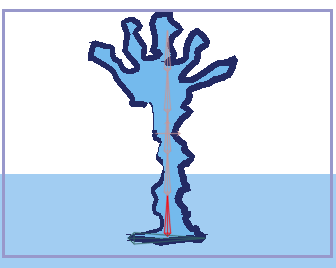
For this tutorial, we'll start with a project file that's almost finished. It's named "Tutorial 5.3" and it's located in the "Tutorials/5 - Animation" subfolder within the main Moho folder. Open this file in Moho, and you should see something like this:
Starting point for this tutorial.

We're interested in the Skeleton layer here - make sure it is the active layer. The skeleton here is partially animated - go ahead and play it back to see what you're starting with. In case you were wondering, only the lowest vertical bone in the skeleton is actually animated. The other bones are using bone constraints to follow the motion of the lowest bone.

Rewind the animation to frame zero, and use the Select Bone tool to select the lowest vertical bone as shown below:
Select the lowest bone.
In the Timeline window, click the "Graph Mode" popup box and turn on the "Enable graph mode" checkbox. Double-click the Selected Bone Rotation channel icon - this is the first channel icon on the left side of the timeline, and looks like this:  . The first click turns on the display of the channel in the graph, and the second click makes it the active channel for editing. By default, not all channels are visible, since this would just cause too much visual clutter in graph mode. For similar reasons, only one channel can be active for editing in graph mode. Double-clicking a channel's icon makes it active for editing.
Now, clear up the graph a bit more by clicking once on the icons for layer translation, scale and rotation to turn them off: 

 . Finally, press the End key on your keyboard - this rescales the graph to accommodate the currently active channel, in this case the selected bone rotation channel. After all of these adjustments to the graph, it should look like this:
Graph mode.

In the graph you can see three keyframes. These are just like keyframes in the normal timeline, but instead of just being spread out along a horizontal line (time), they are also spaced vertically (value). Between the keyframes, a curve is drawn that represents the value of the selected bone's rotation angle. Looking at this curve, you can tell that over the first second (frames 1 to 24), the bone rotates from an angle of 1.57 to an angle of about 1.05 (we don't care about the exact values). Then, in less than half a second it rotates back again.
Note: in the timeline's graph mode, angles are displayed in radians so that they'll be closer in magnitude to other values like translation and scale. However, if you want to see curves displayed in degrees you can tell the timeline to do that in Moho's preferences dialog.
Now we're going to edit the bone's motion by modifying the graph. First, set the current time to frame 48 and select "Reset Bone" from the Bone menu. Press the Page Down key to give yourself some room in the graph to work. Next, click the keyframe at frame 33 and drag it upwards slightly as shown below. If you hold the <alt> key while dragging a keyframe in graph mode, you will only be able to drag it vertically. Hold the <ctrl> key to move it only horizontally.
Move a keyframe.

Next we're going to add a new keyframe directly on the graph. Right click on the graph around frame 37. In the popup menu that appears, select "Add Keyframe". A new keyframe will appear on the graph - drag it to the location shown:
Add a new keyframe.

Let's add three more keyframes like the previous one. Add these keys at frames 40, 43, and 46. You don't need to set the time to the frame you want to add a key to - just right-click at the correct frame and add the new key. Don't worry if the key isn't exactly at the frame you wanted, since you can easily drag it into position. Move these new keys so that the curve looks like this:
The final graph.

What this wiggling curve represents is sort of a springy back-and-forth motion that decreases over the span of just over half a second. You could have animated this using the normal timeline and the bone rotation tool, but this gives you another way to understand the motion you're creating. Play back the animation to see what it looks like.