The Style window.
The Style window is where you set up colors, line widths, fill effects, and other properties to control the appearance of your vector artwork. The Style window has a lot of controls, but it's not too hard to understand if you break them down into six sections:
The Style window.
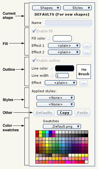
The Current Shape controls let you select and name shapes and styles. The Shapes popup menu lets you select a shape in the current layer. Only named shapes appear in this menu - to name a shape, simply select it in the editing window and enter a name into the "Name" field.
The Style popup menu provides you with a list of all styles in the document. A style is the same set of information used by a shape (color, line width, line brush, effects, etc.), but it doesn't actually appear on its own in your animation. Instead, after creating a style, you can apply that style to one or more shapes. For example, you might create a "Skin" style, and apply it to all the body parts of a character. Later, if you want to change the color of the character, just modify the Skin style, and any shapes that use that style will change instantly. Use the Style popup menu to create new styles and to select a style for editing. The Tutorials section of this manual will walk you through the process of creating and using styles.
Just above the Name field is a text label that indicates the currently-selected shape or style. When no shape or style is selected, this label will say "Defaults" - any changes to fill color, line width, etc. that you make in the style window will be applied to any new shapes you create. When a shape is selected, the label will say "Shape" - any changes you make now will apply to just that one shape. Finally, when a style is selected, the label will say "Style" - any changes you make to a style will not only affect that style, but also any shapes that use that style.
These controls allow you to set the appearance of a shape's fill region. First, be sure that "Enable fill" is turned on or off, depending whether you want that shape to be filled or not. Click the fill color rectangle to pick a new color for the fill. A color picker dialog will appear. In addition to the actual color of the fill, you can choose the level of transparency in the color picker dialog.
Moho's color picker.
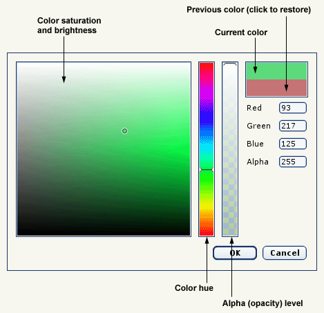
If a style has been applied to this shape, the style's color will be used instead of the shape's color. Turn on the checkbox to the left of the color swatch to override the style's color.
Below the fill color are two popup menus that allow you to choose one or two fill effects to be applied. These effects include such things as color gradients, spots, and shading effects. Just pick an effect from the menu to apply it to the fill. If you choose two effects, they will be applied in order, one on top of the other. For example, you could choose "Gradient" for the first effect and "Spots" for the second effect. The result would be a color gradient for the background of the fill, with spots drawn on top of it.
To the right of the fill effects are buttons that allow you to control the specifics of the fill effect. If a fill effect has been chosen from the popup menu, these buttons will bring up a dialog that looks something like this:
Gradient settings.
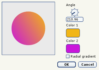
This is the dialog used to control the gradient effect. The angle control determines the direction of the gradient. Below that are two controls for the colors at each end of the gradient. Finally, a preview area: after modifying the other controls, this region will display a small preview of the effect.
These controls allow you to set the appearance of a shape's outline. First, be sure that "Enable outline" is turned on or off, depending whether you want that shape to have an outline or not. Click the line color rectangle to pick a new color for the outline. If a style has been applied to this shape, the style's color will be used instead of the shape's color. Turn on the checkbox to the left of the color swatch to override the style's color.
Below the line color is a text field used to set the line width in pixels. If a style has been applied to this shape, the style's line width will be used instead of the shape's. Turn on the checkbox to the left of the line width to override the style's width setting.
To the right of the line color is a box that displays a preview of the brush used to draw the line. Click the box to select a brush. Finally, the last control in the Outline section is a popup menu used to apply a line effect to the shape's outline.
Below the Outline controls are two popup menus used to apply styles to a shape. By selecting styles from these menus, you can apply up to two styles to a shape. The applied styles will be used to control the shape's color, line width, brush, fill effects, etc. Styles are very useful when you want to re-use the same appearance on several objects in a scene - if you later need to modify those objects, all you need to change is a single style. These popup menus let you apply styles to a shape - to create or edit styles, use the Styles popup menu at the very top of the Style window.
There are three buttons that we've classified as "other" controls. Press "Defaults" to switch back to editing the default fill and line properties - if a shape or style is currently selected, it will be de-selected. Press "Copy" to copy the properties of the selected shape or style. Finally, press "Paste" to apply a previously copied set of properties to another shape or style.
Finally, at the bottom of the Style window is a set of color swatches. You can use these as a shortcut for selecting colors for your objects. Just click a color in this palette to assign it as the selected shape's fill color. Right-click a color swatch to assign it as the selected shape's outline color.
The "Swatches" popup menu lets you select from different sets of color swatches. These color swatches are just image files stored in a folder called "swatches". You can add your own image files to this folder, and they will appear in the Swatches popup menu the next time you start Moho. Or, you can select "Custom Image..." from the popup menu and Moho will prompt you to select an image file to use.