How could I miss this? It's great!
I definitely like the cutout approach. It introduces a level of abstraction which allows you to get away with a lot of things. And it's much faster to produce.
OK, possible improvements:
I really like the 2D backgrounds with the collage elements. However, photographs are always tricky to integrate. You could try to apply some filters on it to make it look like a bad colour xerox, or make it a hard black&white which you can colour very roughly. Sofa, table and bookshelves are nice. Broad pencil outline over collage element - that's a very good style. Don't forget to have enough contrast between elments.
The yellow crayon on the wall - maybe it looks better if you don't draw around the window, but just colour in straight horizontal lines and then paste the window on top?
I just did some quick sketching over the BG:
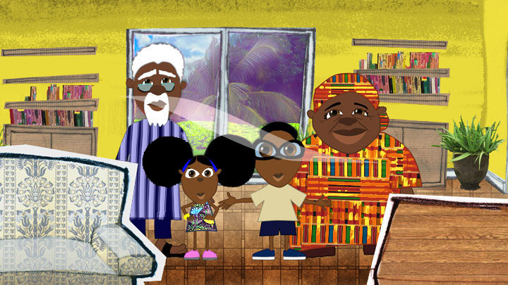
Think of where the light comes from. In the clip I noticed that the top edges of the wall should be darker - and why is the outside world in the window that dark? If this is a series, you will need to differentiate between night and day settings.
Boy and Old Man have their head nicely separated from the body, but Girl and Grandma not. Add some yellow patches in Grandma's fabric? And change the Girl into something brighter.
I've added stripes to Grandpa to make the Girl's hair more visible.
I've messed a bit with the Girl's face:
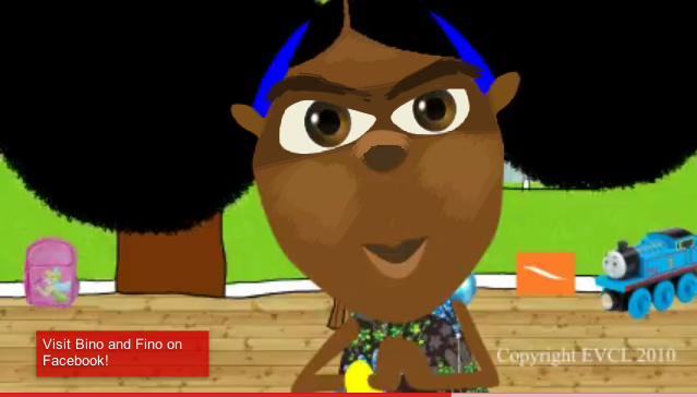
Problem is that you need to make her expressions readable, but have dark elements on a dark ground. So I:
- put a darker brush behind her eyes (to indicate shadow) and some light on her nose and cheeks
- gave her eyebrows - nothing is better for expressions than that
- made her eyes smaller - a pupil totally surrounded by white is something which should be reserved for the most extreme expressions only
- made the white in the eye a bit yellowish (about 5% darker) - it still looks white, but now you have the total white reserved for absolute highlights.
I'm not sure about the airbrushed gradients in the pupils. Maybe a flatter brush approch would be better?
Iwaxana's comment about the eyes was correct. Narrow eyes are associated with "bad" characters, not with children's innocence.
Right now all characters don't tilt their heads. Maybe you should try to introduce some head-up, head-down poses, which will add a whole range of expressions, especially since small children interact with taller grown-ups. Also side views need to be done. (The one of Grandpa in the clip doesn't convince me.)
I'm curious about the mouth movements. Grandma in particular has the potential for really broad face distortions ...
Have a look at the work of Eric Carle (
http://www.analucia.net/imsblog/Eric-Carle/), especially his way to collage painted papers, that's a nice way to get texture and shadows into characters without going into realistic 3D shadows and stuff.
Overall your style is really great, and I'd like to see that show. And the music is great, too!
****
How's the animation scene in Nigeria? This is the type of show I'd like to participate in, but you will not find something this colourful and bright outside of Africa ...


