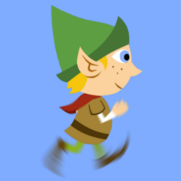
Motion blur comes from life action photography/film and occurs when an object moves too fast for the fastest shutter speed to give a sharp impression. You all know how it looks like, here's a good example:
Faster moving elements leave longer trails than slower ones. Bright elements are better visible than dark ones, and you need a good brightness contrast between moving elements and still backgrounds (or vice versa). Trails are curved in the path of motion: the hedge in the back has straight blur, the feet have curved blur.
CGI animation (like by Pixar) naturally uses this device to imitate a real-life-like look. In general they use motion blur in the same circumstances, scenes and camera angles as if it would appear in life action. It doesn't define a movement, it only refines a certain look and adds a little bit of extra "smoothness" to the animation. If it were left out, the animation might look a little bit jerkier, or give that odd effect of recent digital video in bright light (like sports documentation) where they use an extremely short shutter speed so each frame of video is of pristine sharpness. The effect is very much like the one of stroboscopic films.
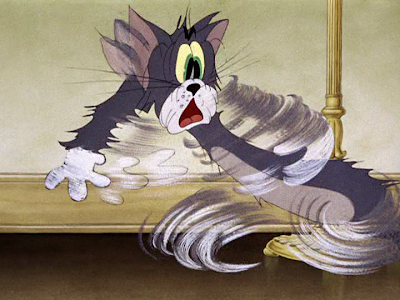
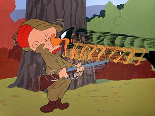
2D drawn animation used something similar, the smear, not to enhance visual realism, but to indicate very fast exaggerated movement. This is not an artifact created by the shutter, but a graphic symbol with its own rules of application.


As you can see, the swishes (done with drybrush) indicate arcs of movement within a single frame - no software could figure this out by itself. Often the smear is combined with a multiple. A multiple (also called ghost image) is a frame containing several frames of motion in one - like this:

The rules can be written like this:
- - All swishes follow the path of motion.
- Very fast movement is done in a continuous swish.
- Movement over a longer screen distance can have multiples, their spacing is the same as it would be in normal, slower motion.
- Multiples often only show the outline of one side, not both. An approaching element has the front outline visible, a departing element has the back outline visible.
- Showing both outlines is recommended for vibrating or back-and-forth motions.
- Multiples omit most details and concentrate on the visible ones with the best contrast.
- Lines parallel to motion path are drawn, others more likely left out.
- Usually the swish is done in only 1 frame, for a very fast movement. There can be a "swish trail echo" for some frames afterwards, but not more than 5 or so.
- Repeating movement, like running legs or spinning wheels, use the same 3 or 5 shwishes repeatedly. Any multiples will have to be spaced differently in all frames, they must not follow an A-B-A pattern because then they would appear blinking. Also don't use the same number of multiples in each frame.
- Having one smear between extremes gives a very snappy impression, like a hit. Inbetweens for a slow in/out have to maintain the spacing of the multiples within the smear.
Pure multiples (without smear) are also used to show impossibly fast movements in a very short time, or even several movements at once. I couldn't find any good examples yet, but there are many: at Disney (Alice in Wonderland: the carpenter, Donald in several shorts) and Tex Avery.
(Very entertaining screen grab collections can be found here: http://animationsmears.tumblr.com/ and here: http://tralfaz.blogspot.com/)
I did just a little test for myself with this GIF I found (the Shadoks, by Jacques Rouxel):

I wondered if the animation could be enhanced without losing that snappy quality, so I added inbetweens, squashes, and a multiple:


