
I use the text feature very infrequently in AS but when I do I have not seen any any of these problems. I mostly use very simple fonts like Verdana, Arial or Helvetica. Recently I used some decorative fonts but for one or two words at most. Also I am on a Mac so font handling could be quite different.
-vern
accuracy of still (single frame) renders?
Moderators: Víctor Paredes, Belgarath, slowtiger
-
synthsin75

- Posts: 9981
- Joined: Mon Jan 14, 2008 11:20 pm
- Location: Oklahoma
- Contact:
OH yes, I have experienced that. That I don't do. But have deleted points, edges. etc., assuming that if I couldn't see a problem in the design view, then there was nothing to worry about.
Isn't there also a caveat against creating stuff in a frame other than 0 (and then copying it back to 0). I've done quite a bit of that.
I will try the individual fills. I still don't exactly what that option does-- "create one fill". I guess it treats all your letter and words as one shape instead of 100 different ones? Clever, time saving, maybe problematic.
-
synthsin75
- Posts: 9981
- Joined: Mon Jan 14, 2008 11:20 pm
- Location: Oklahoma
- Contact:
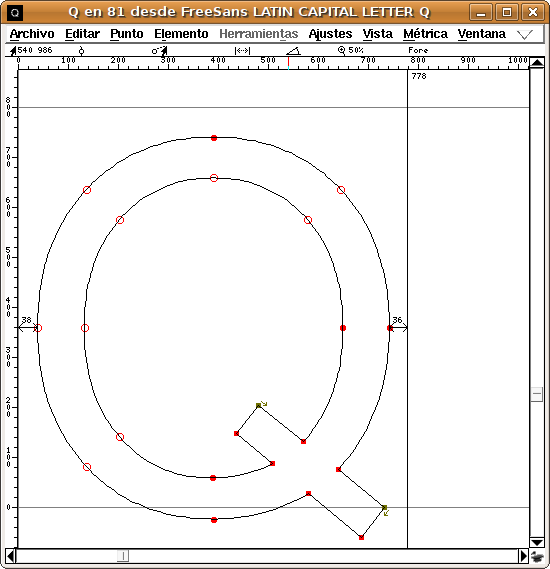
I used FreeSans to generate that 'Q'
See the font definition when open it in fontforge:
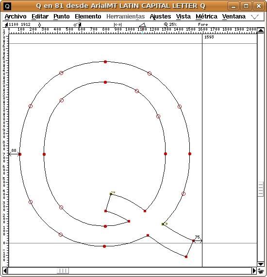
and now the same letter but in Arial:
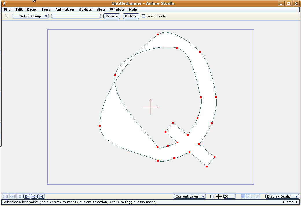
And now how the FreeSans Q in Anime Studio:
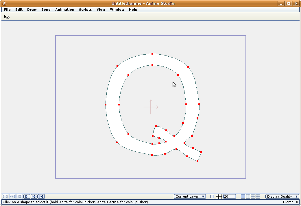
And the Arial Q in Anime Studio:
In the FontForge capture windows, the outlined red dots means a symmetrical tangent vertex. If the dot is filled it means a split tangent (angle or length)
The FreeSans font is simpler than the other one (less control points) but it renders worse.
Is FreeSans a bad formed font? I don't know. It is used as it is: a truetype font (reproducible by its glyphs at any size).
In my honest opinion the built in algorithm that render the fonts should be reworked a little.
-G
See the font definition when open it in fontforge:
and now the same letter but in Arial:
And now how the FreeSans Q in Anime Studio:
And the Arial Q in Anime Studio:
In the FontForge capture windows, the outlined red dots means a symmetrical tangent vertex. If the dot is filled it means a split tangent (angle or length)
The FreeSans font is simpler than the other one (less control points) but it renders worse.
Is FreeSans a bad formed font? I don't know. It is used as it is: a truetype font (reproducible by its glyphs at any size).
In my honest opinion the built in algorithm that render the fonts should be reworked a little.
-G

Hi guys. I wanted to revisit this topic.
Regarding text: I thought I had solved my problem before by choosing a new font. However, I copied that text to another character, and manipulated it to match the appropriate perspective, and when I rendered, BAM! Super corruption on every B, and most letters that a "hole" in them (capital R, D, etc.) I didn't realize manipulating the points (shear, perspective, scale) on shapes that were already proven "valid" could corrupt them, but I guess so? Or just letters?
Also in addition to the no-nos I was warned about near the beginning of this thread (deleting points, loops in curves, offscreen shape creation), are there other things to avoid when building a shape? I just spent a ridiculously long time fixing an eye that had glitches. Don't know what I did to deserve them. Is there a certain way of connecting points that AS doesn't like, that makes a shape go bad when it's created? What about scaling, using the split curves script, anything?
-
Farbklecks
- Posts: 126
- Joined: Tue Jun 05, 2007 7:50 pm
- Location: Germany
- Contact: