
I like that style!
Great combination of both.
-vern
Trying to get a more dynamic template...
Moderators: Víctor Paredes, Belgarath, slowtiger

Did another character (two, kind of) for the project I've been working on; I've been playing with thicker outlines in the places where I do use them, treating them more like shading (I got the idea from Human and Vern's conversation above, of course). It looks alright in places, but I feel like it clashes with more detailed places that call for thinner lines (namely the face). I might be able to even it out if I put some more lines in places like the hands or feet... any opinions on this?
The Gryphonkeeper:
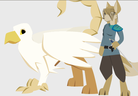
http://foxmage.com/GryphonAndKeeper.anme
She's just a modification of the template I made for the last character. The gryphon itself uses a lot of the same concepts ("control" bones are its neck, base of its tail, and end of its beak). Its wings... gah, I hate doing wings in AS. They're unwieldy but in the final product I won't be doing much with them ayway.
Comments, criticisms, etc. welcome.
The Gryphonkeeper:
http://foxmage.com/GryphonAndKeeper.anme
She's just a modification of the template I made for the last character. The gryphon itself uses a lot of the same concepts ("control" bones are its neck, base of its tail, and end of its beak). Its wings... gah, I hate doing wings in AS. They're unwieldy but in the final product I won't be doing much with them ayway.
Comments, criticisms, etc. welcome.
If I may stray from your request for comments on strokes?
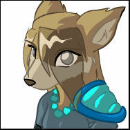
I would be concerned that the anime hairdo may detract from your terrific fox/jackal guy.
As for the gryphon, I assume this is still quite early and you're working to refine it. History is full of gryphons, and they tend to have lots and lots of character. The best gryphon is possibly John Tenniel's illo for the Lewis Carroll books.
I'm not aiming to be too historically/mythically accurate (I've already mixed a bit of manticore in there) but you're right about it needing a bit more character, perhaps. Namely, I'd say a bit more "bird of prey" and a bit less "pidgin".human wrote:As for the gryphon, I assume this is still quite early and you're working to refine it. History is full of gryphons, and they tend to have lots and lots of character. The best gryphon is possibly John Tenniel's illo for the Lewis Carroll books.
I found some of Tenniel's illustrations - nice stuff indeed. I'll work on the gryph a bit more tomorrow.
Actually, I was aiming to make the Gryphonkeeper a fox/jackal girl. I thought I changed the body shape and face enough to make her more feminine, but if it trips people up I see that as a sign it needs work =P. Voices will inevitably clear up any confusion, but I'd hate for my voice actors to be the only way to tell genders apart.human wrote:I would be concerned that the anime hairdo may detract from your terrific fox/jackal guy.
Anyway, as for the hair, can you clarify what you mean by "detract from"? These are based off designs I did a while ago and I don't want them to clash too badly with my normal art style (which, sadly, has long since been corrupted by the evil that is anime hair). Of course, designs can be changed easily, but I'm not sure I understand your comment about the hair.
Hmmm, well, sorry, I guess I get confused easily.
Apparently you've been working on two characters in parallel and I didn't realize that.
Now that I see the boob lines I understand about the other character.
Speaking personally, I like the graceful lock of hair on the Jackal but even when I see your original model for Gryphonkeeper I think the hair over the eyes detracts away from the appeal of her face. Less hair, I urge you, less hair--at least in front.
Just one other thing... again speaking personally... your bitmap models obey the anime genre standards pretty rigorously I suppose, but I like the greater stylization of your simple angular models.
But don't let my personal taste interfere... it's a drag to do that to people (as I have learned)....
-
funksmaname

- Posts: 3174
- Joined: Tue May 29, 2007 11:31 am
- Location: New Zealand
Kazerad,
I love the bold style and colouring of your characters nice job... and i'm still intrigued by your rigging method - i bet it will add a lot of life to show 3D-esque rotation when animating... even though its not full turns i think it will add a lot of subtlety and a professional finish.
Cant wait to see a test animation! and thanks for sharing your files
I love the bold style and colouring of your characters
Cant wait to see a test animation! and thanks for sharing your files
No need to apologize; my attitude towards art is that the "viewer can't be wrong". If someone misinterprets something, it's a sign that I'm not making things clear enough. Hence, everyone's opinion is important, even if it's "wrong".human wrote:Hmmm, well, sorry, I guess I get confused easily.
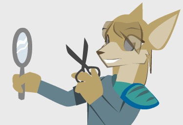
I gave her a trim. Would you say the hair is less distracting now?
-
Patrick McClintock

- Posts: 85
- Joined: Fri Mar 09, 2007 5:08 pm
- Location: U.S.A.
Hair
Kazerad,
I assume that you made the hair transparent to keep the eyebrows showing through, as in anime style. Personally I'd like to see the hair as an opaque layer, Just to clear up some of the 'busyness' on the face. In other words i think that the hair is a bit confusing to the viewer.
Brilliant work however. I love the use of position constraints!
P.
-
slice11217
- Posts: 279
- Joined: Thu Mar 30, 2006 6:12 pm
- Location: Verona, New Jersey
I have a question: how did you come about the numbers that you plugged into the bone constraints? Was it via trial and error, or was there some mathematical formula involved?Kazerad wrote:]These rigs are mostly me testing ideas for how to get complex characters to move without looking robotic. To get full control you need a mix of "Manipulate Bones", "Translate Bones", and "Scale Bones", though all the mechanisms are fairly simple.
I don't think I've ever made a model with more than four layers before.