A.S. visual update

Have you come up with a good Moho trick? Need help solving an animation problem? Come on in.

Moderators: Víctor Paredes, Belgarath, slowtiger

Post Reply
jose1984alberto
Posts: 99
Joined: Sat Jun 06, 2009 6:34 am
Location: Portoviejo
Contact:

A.S. visual update

Post by jose1984alberto »

sup guys, girls, whatever...

i was playing with AS and thought that i coukd change the icons, so i got to it, at first i just changed the colors, but then i thought "wat the heck", so i designed new ones, this is wat a have so far

Image

wat do you think?

these are the files:

ImageImageImageImage

hope you like it, i will soon come back with more...
User avatar
Rai López
Posts: 2242
Joined: Sun Aug 08, 2004 1:41 pm
Location: Spain
Contact:

Post by Rai López »

...I LIKE IT! It remember me to more standard APP icons (so I can imagine Lost Michael wouldn't opine the same :lol:). Of course all this are secondary issues, but definitely little changes like that could contribute to make AS apparence a little less "austere" and be more accordingly with the program feel, so... thanks for create & share :)

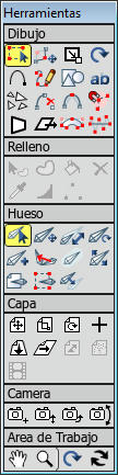
Myself wanted to revise too the layer icons used in my new *special* layer tool but... I sadly discovered that I haven't the patience nor the talent for such a task! And I have finally used again original variations that, although never convince me at all, is the most easy & quick solution...

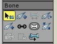
...BTW! I'd probably treat to make the scale bone tool more accordingly with the real behavior into the program to avoid confusion, I mean, scaling the bone length instead the bone width, of course bone width is too proportionally scaled when you scale a bone, but... I think the other way could be more representative, only a though...

EDIT: Ah! I see now... that is the manipulate bone tool, jeje... so forget the last part :P
...
User avatar
super8mm
Posts: 340
Joined: Sun Oct 12, 2008 11:22 pm

Post by super8mm »

Once you have them all done I'll use them, they look good.
jose1984alberto
Posts: 99
Joined: Sat Jun 06, 2009 6:34 am
Location: Portoviejo
Contact:

Post by jose1984alberto »

Finished the bone tools, wat do you think?

ImageImageImageImageImageImageImageImageImageImageImage

soon more updates
User avatar
super8mm
Posts: 340
Joined: Sun Oct 12, 2008 11:22 pm

Post by super8mm »

Works also in the timeline you just have to change the hue to red for the selected lines.
User avatar
Rai López
Posts: 2242
Joined: Sun Aug 08, 2004 1:41 pm
Location: Spain
Contact:

Post by Rai López »

I still like'em! :D The only one that could result a little messy/tangled to me is the Reparent bone tool icon, I don't know if the little red arrow could be more hight or something... OTOH, of course, the Scale bone tool icon seems perfect now! :)
...
User avatar
Víctor Paredes
Site Admin
Posts: 5658
Joined: Wed Jan 26, 2005 12:18 am
Location: Barcelona/Chile
Contact:

Post by Víctor Paredes »

I really like them. I tried with better icons too, but I haven't the talent.
I'll be waiting for more :D
Image Image Image Image
Moho Product Manager

www.mohoanimation.com
Rigged animation supervisor in My father's dragon - Lead Moho artist in Wolfwalkers - Cartoon Saloon - My personal Youtube Channel
User avatar
super8mm
Posts: 340
Joined: Sun Oct 12, 2008 11:22 pm

Post by super8mm »

I'm using them now with a couple of exceptions.

I had to darken all of them since they almost disappear in my custom GUI colors. Also I used a different icon for reparent bone. I just used the rotate bone erase the the rotating arrow and placed a red arrow pointing in the middle of the bone similar when you see arrows that link parented bones.
jose1984alberto
Posts: 99
Joined: Sat Jun 06, 2009 6:34 am
Location: Portoviejo
Contact:

thanks

Post by jose1984alberto »

glad youre liking it, i got some more draw tools, just havnt had the time to upload them. i soon will...
jose1984alberto
Posts: 99
Joined: Sat Jun 06, 2009 6:34 am
Location: Portoviejo
Contact:

Post by jose1984alberto »

wats up people, im back with some more updates, i almost finished the drawing tools, im not completly happy about them, but i still like them better then the default buttons

Image

as you can see, i also changed the color scheme of AS cus of the icon colors, but i like it better that way too, so it really isnt a problem for me, these are the icons:

ImageImageImageImageImageImageImageImageImageImageImage

I would love to make some corections to all of them, but i spend too much time just making them, so by now, i cant afford to correct them...
arfa
Posts: 244
Joined: Tue Dec 23, 2008 8:15 pm
Location: New Zealand

Post by arfa »

Well done. Some real improvement here. Thanks.

I wonder if you could post your photoshop (or whatever software) file? I would like to play about with some of these.

thanks again
User avatar
slowtiger
Posts: 6079
Joined: Thu Feb 16, 2006 6:53 pm
Location: Berlin, Germany
Contact:

Post by slowtiger »

Sorry, I prefer the original ones. They could possibly get improved a bit, but not in the direction you chose to take, not by adding stuff all over the place.

The trick with icons for tools is that they must be as simple as possible, at the same time as different from each other, and overall readable without confusion. The original bone does that: a clear white shape. Compare with your version: while it may look like the "bone" in the layer, it is only a cluttered grey blob, not readable at all.

Also the convention is that you only should show the tool, not what the tool is manipulating. That's why the red dots are superfluous, aside from being optically distracting.

Icons usually are a representation, not a depiction.

(I have designed GUI elements and icons for nearly 20 yrs now, for applications as well as websites.)
jose1984alberto
Posts: 99
Joined: Sat Jun 06, 2009 6:34 am
Location: Portoviejo
Contact:

Post by jose1984alberto »

slowtiger wrote:Sorry, I prefer the original ones. They could possibly get improved a bit, but not in the direction you chose to take, not by adding stuff all over the place.

The trick with icons for tools is that they must be as simple as possible, at the same time as different from each other, and overall readable without confusion. The original bone does that: a clear white shape. Compare with your version: while it may look like the "bone" in the layer, it is only a cluttered grey blob, not readable at all.

Also the convention is that you only should show the tool, not what the tool is manipulating. That's why the red dots are superfluous, aside from being optically distracting.

Icons usually are a representation, not a depiction.

(I have designed GUI elements and icons for nearly 20 yrs now, for applications as well as websites.)
yup, thats exactly why i dont like my drawing tools, individually the looked ok, but when i saw them all together, its just a mess. but even so, i still like them better then the default outdated ones, like a said, i would love to make some corrections, but i just dont have the time right now...
Post Reply