Page 3 of 4
Posted: Thu Jan 29, 2009 11:30 pm
by Antonin_K
It's weird and totally crazy!

Posted: Fri Jan 30, 2009 6:01 pm
by uddhava
slowtiger wrote:
Oh, and where to get these: gutenberg.org carries lots of old issues of "Scientific American" and the like. Use google image search.
Thanks for this information and great animation. Thanks to all of the pros here giving out free animation knowledge and resources. Pretty generous I would say.
udd.
Posted: Fri Jan 30, 2009 11:46 pm
by slowtiger
The first scene I already posted elsewhere. The zeppelin is an image and serves as a mask for a colour layer which is set to
multiply. After multiplying the zeppelin group I changed the colours.
http://www.slowtiger.de/examples/zeppelin.html
The second scene is another test with warping images. Whereas it works nicely with the head, I don't like the legs (body and tail are layer bound). I'll do them the old-fashioned way with separate images. Also I like to put each leg into its own bone layer, easier to maintain overview of the keys.
http://www.slowtiger.de/examples/huhn.html
Posted: Sat Jan 31, 2009 4:21 am
by human
uddhava wrote:I'll have to look up some books with woodcut art to use in some animations when I visit the states.
http://store.doverpublications.com/
I don't think that you ought to count on downloading woodcuts from the Internet because it is unlikely they will have enough resolution.
Your time would be better spent scanning the images from a book (or using the CDs which Dover has begun to bundle with some of their titles).
By the way, I'm pissed at slowtiger

for thinking of reducing the contrast before I could think of it
In simple terms, the less contrast, the less pervasive the moire will be.
visually speaking, slowtiger's experiments would hold up quite well if he chose to crank down the palette to dark grey on light grey (or the colorized equivalents)
Posted: Sat Jan 31, 2009 10:40 am
by slowtiger
Actually none of this is my original idea. Woodcuts are a source for animation nearly since the beginning of animation, and so are the recipes for their treatment.
A very nice example for digital treatment was recently done for BBC Channel 4:
http://dekku.blogspot.com/2008/04/bbc-m ... -mind.html "The Medieval Mind" trailer. Here the artists chose to color the black lines as well as the white areas.
Woodcut animation is a subset of cutout animated collage like photo animation. One of the first and most famous films in that technique is "Frank Film" (
http://www.youtube.com/watch?v=pa9r5Z4hC_U) I always liked this technique even when I was a child. Hence I am a manic collector of books and ripped pages from newspapers. Unfortunately the cardboard boxes full of clippings get lost during removal days somehow ..
Posted: Thu Feb 05, 2009 5:02 pm
by slowtiger
Here's the gear and clock from the other thread. This is just a test composition, not an actual scene. The shadows come out nicely, as well as the letters rotating with the right cogwheel.
http://www.slowtiger.de/examples/gear.html
Getting the teeth all interlock correctly is quite a task. For a short scene, I just don't care as long as the different wheel movements fit convincingly enough. For a longer scene, one has to calculate exactly. (It's first measuring the radii of the wheels from center to midway between the teeth, then calculate the circumfences and divide one through the other.) In my case, the original material wasn't that accurately drawn to start with, so the result is just "good enough" now.
Posted: Thu Feb 05, 2009 5:54 pm
by jahnocli
Looks good. And all controlled with one bone?
Posted: Thu Feb 05, 2009 10:04 pm
by slowtiger
Yes, only the big wheel on the left was animated, all other gears got the movement via angle control bone.
Posted: Fri Feb 06, 2009 6:46 am
by chucky
Looks beautiful, Slowtiger.
I love this retro style.
On the subject of moire that has popped up here and there, I don't know if this has been mentioned or even if it's a desirable solution but here goes.
I was thinking to myself that a grain could help cut it down, I actually looked it up as well to confirm that people might be using this method and it appears they do.
Just a thought , it might be better than the blur method that I have also heard of.
Posted: Fri Feb 06, 2009 6:54 am
by chucky
Hi again, apologies Slow, I just read your post a couple of threads away, where you make the exact same suggestions, so you clearly have that covered. Like I should have known.

Posted: Sat Feb 07, 2009 2:26 am
by Mikdog
This is great! Very nice. I'm gonna come back to this thread in a bit and see what else ya done.
Posted: Thu Feb 12, 2009 4:52 pm
by slowtiger
http://www.slowtiger.de/examples/hochrad1.html (1.2 MB)
This one's a mistake, but an interesting one. I wasn't finished with rigging, so all images were bound via flexible binding to all bones, but the bone dependancies were all there. See what happens if I turn one wheel ...
Don't know if I can make something useful with it, but I wanted to share the surreal result with you. AS is obviously able to twist and turn an image into itself ... Möbius animation!
Posted: Thu Feb 12, 2009 10:27 pm
by human
I hate umlauts

Posted: Thu Feb 12, 2009 11:00 pm
by slowtiger
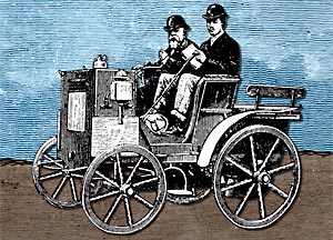 http://www.slowtiger.de/examples/car.html
 (3 MB)
This was fun to build. I had that car with spoked wheels, and the task was to rotate the wheels in perspective. I couldn't use the image's spokes because they were already elliptical, and the hub was drawn in perspective too.
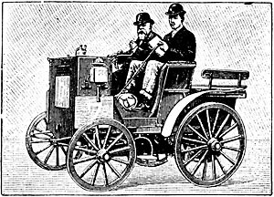 Original car
So I drew one spoke in AS, multiplied and rotated it until I got 8 of it. I carefully set that level's origin to the middle of the spokes. Then I put that vector layer into a group layer and adjusted its origin as well. I rotated the group layer until the cross (the origin) was orientated like the axes of the elliptic wheel, then used scaling to create the perspective. Now I could rotate the spokes vector layer inside, and the group layer put everything in perspective. As a last touch I duplicated the car image and erased everything expect the front half of the tires and the hubs. Duplicate car layer in AS, exchange the bitmap: fits perfectly and covers the spokes where it should.
I think this can be done with an equally good result with some masking and no group layers. My version requires rotating each wheel separately, a version with masking could use control bones, but can't have the spokes in perspective then. But nobody would notice that anyway ... as well as the very slight animated outline noise I put on the vector spokes.
The rattling of the car is done with a short loop of relative scaling, the car's origin is on the ground. The whole scene is done with just 17 keys: 7 for the rattling, 2 for start and end position, and 2 x 4 for the spokes layer rotation.
This style needs a lot of work in preparing the images, with erasing unneccessary parts and draw missing stuff and separate parts into different files. The car bitmap is 1300 x 1100 px big, a bit of overkill for DVD but good enough for the big screen. Also retouching is easier with material of those dimensions.
Posted: Thu Feb 12, 2009 11:17 pm
by synthsin75
The car looks great. Maybe a little too much rattling for me. It's a little hard to focus on it between the quick rattle and the densely detailed background.
The bike looks like it's peddling itself.