Music Video
Moderators: Víctor Paredes, Belgarath, slowtiger
-
DMacstudios

- Posts: 24
- Joined: Mon Aug 13, 2007 5:01 pm
- Location: Calgary
Looking good!
I have been away for sometime but I am loving what I am seeing. Well done. That fish really rocks. Love your control over the scene. Keep it up!
~If you can keep your head while around you all others are losing theirs, you have not understood the situation~

Name of the song is 'Soundtracks and Comebacks' by Goldfish Live, my favourite electro band. They hail from Cape Town, South Africa. Currently in Ibiza. (www.goldfishlive.com)
Slow, you taught me my animation moves, man I learned a LOT from the bouncing sun file you so helpfully sent me. Also have Richard Williams' 'The Animator's Survival Kit' in the bathroom, so I guess I read that a lot.
Here's my latest scene:
http://www.youtube.com/watch?v=_ZUoIr88L38
(Don't know if its working. Been processing for a while.)
Still not quite right. I have a camera to contend with now. Don't particularly like having camera moves in a scene if I can help it. Also, something not right with the background cupboard and colours. Clashes with the fish's silhouette or something. And the outside colours. And his final jump. And the passing of the outside wall. And the sky. Ay yay yay, I'm gonna go to sleep and look at this in the morning.
Slow, you taught me my animation moves, man
Here's my latest scene:
http://www.youtube.com/watch?v=_ZUoIr88L38
(Don't know if its working. Been processing for a while.)
Still not quite right. I have a camera to contend with now. Don't particularly like having camera moves in a scene if I can help it. Also, something not right with the background cupboard and colours. Clashes with the fish's silhouette or something. And the outside colours. And his final jump. And the passing of the outside wall. And the sky. Ay yay yay, I'm gonna go to sleep and look at this in the morning.

Hi Mikdog......I don't mean to give any negative feedback on your project because I absolutely LOVE what you are doing but.....it just struck me....putting that bands soundtrack on Youtube might not be a great idea due to copyright. I would hate to see you get into any trouble. Maybe a good idea is to show them what you have done so far and see what thier reaction is or at least open up some kind of dialogue before you go too far with things?
Just a suggestion.
D.K
Just a suggestion.
D.K
-
funksmaname

- Posts: 3174
- Joined: Tue May 29, 2007 11:31 am
- Location: New Zealand

Camera movement OK, I like your solution for cutting the wall.
The jumps ... seem too slow for me. Maybe half the time long would be better, like an eighth instead of a quarter note, just before the beat. (Horrible to write note values down like this ...) I think of this:
As a general rule within music videos: when in doubt about a movement, make it faster/shorter!
As for the clip snippets on youtube: don't think this will cause trouble as long as it's only such a short clip and only one at a time. At least they want to get famous with it!
The jumps ... seem too slow for me. Maybe half the time long would be better, like an eighth instead of a quarter note, just before the beat. (Horrible to write note values down like this ...) I think of this:
Code: Select all
one   -    two   -   three AND four
                           * jump *
As for the clip snippets on youtube: don't think this will cause trouble as long as it's only such a short clip and only one at a time. At least they want to get famous with it!
Hello, thanks for all the help guys.
Think I understood what you said about the jumps slow. Put another clip up. I'm taking old ones down and keeping one up:
http://www.youtube.com/watch?v=p1KB8wB2Bs4
They know I'm doing a music video. Getting paid
Think I understood what you said about the jumps slow. Put another clip up. I'm taking old ones down and keeping one up:
http://www.youtube.com/watch?v=p1KB8wB2Bs4
They know I'm doing a music video. Getting paid

-
funksmaname
- Posts: 3174
- Joined: Tue May 29, 2007 11:31 am
- Location: New Zealand
-
DMacstudios
- Posts: 24
- Joined: Mon Aug 13, 2007 5:01 pm
- Location: Calgary
Hi,
I also think I'll post things once they've made significant progress. Although I must say, I really do enjoy getting you guys' feedback. Like having a couple extra pairs of sharp eyes
More recent post:
http://www.youtube.com/watch?v=T9OeecrJYQg
I also think I'll post things once they've made significant progress. Although I must say, I really do enjoy getting you guys' feedback. Like having a couple extra pairs of sharp eyes
More recent post:
http://www.youtube.com/watch?v=T9OeecrJYQg
-
synthsin75

- Posts: 9972
- Joined: Mon Jan 14, 2008 11:20 pm
- Location: Oklahoma
- Contact:
I just watched it 20 times just for fun. (Notice the "high quality" button in youtube now!) Overall impression: great.
And now, as usual, for all the little details:
- The jump out of the window: the cut with just the fall has only 3 frames of the character, which is too short and irritates. (Tex Avery once said that 5 frames are the minimum length to recognize an object.) I'd suggest to do a little vertical pan here, with the fish in the middle moving down slowly, but the BG (the wall) panning very fast (and blurry) until he lands - you can get away with a simple jump cut here. Pans are so easily done in AS - so use them! Scene length the same as before.
- Flash in the sky: after the jump he walks on grass (this works nicely), and the sky flashes. I think these flashes should fade out a little bit longer because they are far away, in opposite to the "strobe light" flashes you later use. (Hold maximum flash brightness for nearly an eighth, then fade out for a quarter note ... ah, it's so easy to explain to a musician!)
The strobe light flashes could be more powerful. The cookbook recipe for flashes is something like this:
1 frame totally white
1 frame black
1 frame inverted picture
1 frame normal picture
1 frame totally white
and normal from that on (or having something burnt to ashes ...). Experiment with the sequence to get the most effective one. Maybe two totally white frames are too much if you have a flash every beat. Maybe it's better not to use inverted (white) lines (see below), but have black lines (or grey ones) and totally faded colours instead. In any case, I see you make pretty good use of the layer blend modes.
- Colour changes: I had some problems to follow the fish because sometimes he simply disappears. I think you should prepare a couple of well-working colour combinations and use them again and again.
Fish having the same colour as BG: this only works in a simple scene like in the beginning, with the fish being the only detailed object in front of a plain area without detail.
Fish having different colour than BG: take care to always maintain enough contrast. Some shots will not work in b/w because both colours will have the same brightness level. Also try to make the different colours really different. A good little helper for this is a colour circle (the Mac OS has it built-in) like this one:
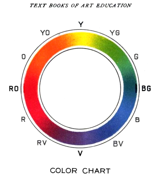 (from http://en.wikipedia.org/wiki/Color_wheel)
Just choose one colour for the fish and a colour roughly out of the opposite half for the BG, and you have maximum colour contrast. Now adjust the saturation and brightness in a way to set the fish apart from the BG. I think it's best to let the fish always be brighter than the BG, at least you shouldn't use an inverted scheme between that. Maybe later a whole sequence could be done with the fish being dark (or even a black silhouette) against brightly coloured shiny BGs?
- Crushing details: Another reason why I couldn't "read" the fish is that the BGs hold too much detail. Have a look at his legs in the last sequence: the lines on his legs have the same spacing as the lines of all the stuff in th BG, so they tend to vanish in the detail.
The problem exists because you use the same drawing style for BGs as for the fish, so our eyes need to work extra to get it all sorted out. In traditional animation, the easy solution would be to tone down the contrast of the BG very much - please don't do that, they need to stay like that!
This needs delicate treatment. First: don't waste your work. Put it where it makes the most effect. If you have a close-up of the fish, use BGs which only have few objects on a plain coloured area. You could accentuate some beat (maybe the 4, but definitely not the 1) by throwing in some of the "full" BGs.
In long shot you can do it the opposite way: use the detailed BGs like now, but throw in one with nearly nothing in it from time to time. (I imagine something like a horizon line and some candelaber cactus ... see George Herriman and Krazy Kat for inspiration.)
- Inverse stuff: this is a tricky one. I'd advise against it. In a fast sequence, mixing black line BGs with white line BGs confuses the audience. You could do better with a larger-scale effort, like using the same (black) line drawing but colour it differently: once bright objects in front of a dark BG, once dark objects in front of a bright BG. This would also improve the "contrast in time": right now the colours following each other sometimes don't make much of a difference.
Also I'd like to avoid stuff without outlines (like the fish changing in horizontal colour stripes), that's just out of style, IMO.
Overall, try to think in contrasts: detail/no detail, bright/dark, flat colour/strong colour, and contrast not only within the picture, but also in consecutive shots. Have a sequence with only flat colour dynamics followed by a sequence where you really flip between normal colour/silhouettes. Try to put them into the right moment to fit the song. Personally I would work out a colour scheme on paper, but that's just me.
Wow, that was long. Please excuse my Director/Producer attitude. But it's so much fun to deal with really high class material!
Some old stuff just to show with what you can get away with as long as you stay to the rhythm and use a lot of contrast: Grace Jones - Love Is The Drug http://youtube.com/watch?v=u6AQgrs_c44 (very shitty quality) with animation by Mike Smith - unfortunately nearly all illusion of movement got lost during compression. I have the original animation on VHS tape somewhere, from a copy of Mike's demo reel.
And now, as usual, for all the little details:
- The jump out of the window: the cut with just the fall has only 3 frames of the character, which is too short and irritates. (Tex Avery once said that 5 frames are the minimum length to recognize an object.) I'd suggest to do a little vertical pan here, with the fish in the middle moving down slowly, but the BG (the wall) panning very fast (and blurry) until he lands - you can get away with a simple jump cut here. Pans are so easily done in AS - so use them! Scene length the same as before.
- Flash in the sky: after the jump he walks on grass (this works nicely), and the sky flashes. I think these flashes should fade out a little bit longer because they are far away, in opposite to the "strobe light" flashes you later use. (Hold maximum flash brightness for nearly an eighth, then fade out for a quarter note ... ah, it's so easy to explain to a musician!)
The strobe light flashes could be more powerful. The cookbook recipe for flashes is something like this:
1 frame totally white
1 frame black
1 frame inverted picture
1 frame normal picture
1 frame totally white
and normal from that on (or having something burnt to ashes ...). Experiment with the sequence to get the most effective one. Maybe two totally white frames are too much if you have a flash every beat. Maybe it's better not to use inverted (white) lines (see below), but have black lines (or grey ones) and totally faded colours instead. In any case, I see you make pretty good use of the layer blend modes.
- Colour changes: I had some problems to follow the fish because sometimes he simply disappears. I think you should prepare a couple of well-working colour combinations and use them again and again.
Fish having the same colour as BG: this only works in a simple scene like in the beginning, with the fish being the only detailed object in front of a plain area without detail.
Fish having different colour than BG: take care to always maintain enough contrast. Some shots will not work in b/w because both colours will have the same brightness level. Also try to make the different colours really different. A good little helper for this is a colour circle (the Mac OS has it built-in) like this one:
(from http://en.wikipedia.org/wiki/Color_wheel)Just choose one colour for the fish and a colour roughly out of the opposite half for the BG, and you have maximum colour contrast. Now adjust the saturation and brightness in a way to set the fish apart from the BG. I think it's best to let the fish always be brighter than the BG, at least you shouldn't use an inverted scheme between that. Maybe later a whole sequence could be done with the fish being dark (or even a black silhouette) against brightly coloured shiny BGs?
- Crushing details: Another reason why I couldn't "read" the fish is that the BGs hold too much detail. Have a look at his legs in the last sequence: the lines on his legs have the same spacing as the lines of all the stuff in th BG, so they tend to vanish in the detail.
The problem exists because you use the same drawing style for BGs as for the fish, so our eyes need to work extra to get it all sorted out. In traditional animation, the easy solution would be to tone down the contrast of the BG very much - please don't do that, they need to stay like that!
This needs delicate treatment. First: don't waste your work. Put it where it makes the most effect. If you have a close-up of the fish, use BGs which only have few objects on a plain coloured area. You could accentuate some beat (maybe the 4, but definitely not the 1) by throwing in some of the "full" BGs.
In long shot you can do it the opposite way: use the detailed BGs like now, but throw in one with nearly nothing in it from time to time. (I imagine something like a horizon line and some candelaber cactus ... see George Herriman and Krazy Kat for inspiration.)
- Inverse stuff: this is a tricky one. I'd advise against it. In a fast sequence, mixing black line BGs with white line BGs confuses the audience. You could do better with a larger-scale effort, like using the same (black) line drawing but colour it differently: once bright objects in front of a dark BG, once dark objects in front of a bright BG. This would also improve the "contrast in time": right now the colours following each other sometimes don't make much of a difference.
Also I'd like to avoid stuff without outlines (like the fish changing in horizontal colour stripes), that's just out of style, IMO.
Overall, try to think in contrasts: detail/no detail, bright/dark, flat colour/strong colour, and contrast not only within the picture, but also in consecutive shots. Have a sequence with only flat colour dynamics followed by a sequence where you really flip between normal colour/silhouettes. Try to put them into the right moment to fit the song. Personally I would work out a colour scheme on paper, but that's just me.
Wow, that was long. Please excuse my Director/Producer attitude. But it's so much fun to deal with really high class material!
Some old stuff just to show with what you can get away with as long as you stay to the rhythm and use a lot of contrast: Grace Jones - Love Is The Drug http://youtube.com/watch?v=u6AQgrs_c44 (very shitty quality) with animation by Mike Smith - unfortunately nearly all illusion of movement got lost during compression. I have the original animation on VHS tape somewhere, from a copy of Mike's demo reel.