So I've never really drew much in Anime Studio Pro, but I wanted to start doing more, and getting to grips with the differences in it versus other illustration applications. Another aspect is keeping the point count down because eventually I hope to animates some of these things. So I have an image of a woman's head I'm tracing, and I have the majority of it, but it's so very flat looking. I'm looking for advice and/or suggestions on adding hilights, shadows, and other details of depth without having a really high point count. Anyone care to share different suggestions, hints, or techniques?
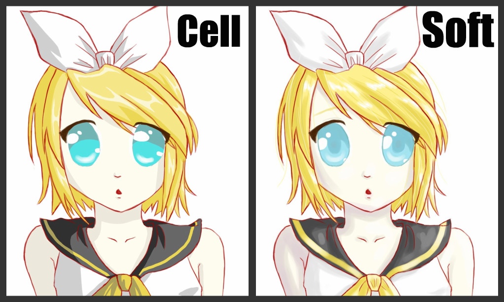
Here is the images... I think it's obvious which is the image, and which is my tracing of it...
I am also new to ASP, but no stranger to simplified vector art. I think one way to make the tracing a little closer to the original would be to fill some shapes with gradients. Inside the hair you could make some jagged shapes along the edge of the highlights, and don't put any strokes on them, just subtle gradient fills. You might be able to do some of that on the face too, drawing wells around the eyes and top of the nose, and filling with subtle gradients. You'll have to add some shapes, and thus some additional points, but the gradients should do much of the work (as opposed to adding lots of stroked lines).
I`d just add that what you did on lips is what you should apply on other elements - three shades of one color, from deep shade to "specular" detail. It could be reduced to only two shades, but than you`ll get a dramatic look which might not be what you need here.
Actually, I was dissatisfied with the lips, especially the small strip of white specular highlight. It's one of the reason why I didn't proceed with any other highlight type of shapes. I also tried on the hair, and to me it just didn't look all that good. I'm sure with practice, I'll get the hang of it, but honestly I'm more interested in animating than I am in drawing. So I may just trace out the body and call it a day.
Watch out for lumpy shapes here and there , but if I was to make any comment, it would be about the colour.
The blue of the eyes does not sit well with the other colours.
Be sure to look into colour design, be careful about using over saturated colours and think of colours like flavours, you shouldn't just go mixing banana and spam, or onion and chocolate willy nilly. So do be careful with every choice.
This is I think the biggest problem for newcomers to image creation, that and layout.
Anime Studio luckily has some good tools to help better colour choices, you can use any image as a swatch or pick any colour with the convenient and omni present picker. That way you can just use a colour scheme from anywhere, already nuanced and perfected.
On the layout topic There is a new rule of thirds overlay which should be very helpful to all, no matter w your level of experience and or skill.
When I take the left one as "ideal" I think you used too saturated colours. Try to tone it down at least 25%. Take care not to get this yellow skin (unless it's on purpose).
The appeal of the original gets lost when you use shapes with closed outlines, and outlines of uniform width. Try and experiment with open lines and tampered ends, to get some dynamic in the drawing.
The biggest difference is the lack of shading and texture. Our problem here is that a simply copied shade pattern will not animate well, because it must change with view and follow the volume, otherwise it will look like paint on a ball. Try to use something reduced and subtle which gives the right idea without being too exact.
AS 9.5 MacPro Quadcore 3GHz 16GB OS 10.6.8 Quicktime 7.6.6
AS 11 MacPro 12core 3GHz 32GB OS 10.11 Quicktime 10.7.3
Moho 13.5 iMac Quadcore 2,9GHz 16GB OS 10.15
Moho 14.1 Mac Mini Plus OS 13.5
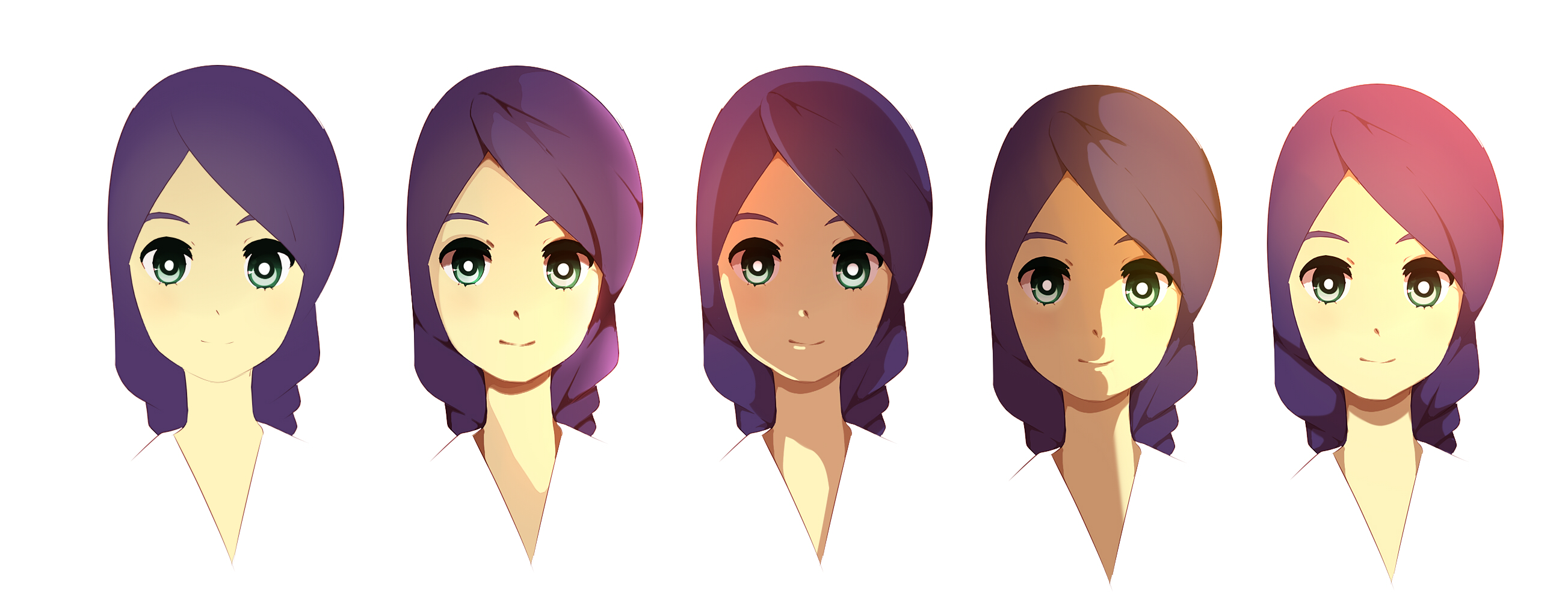
You need to block in colors. Start with darks and then move up to light colors, each in a different vector layer. Then mask all of the color shades to the hair or face. I like to use layer blur at 3 to set good skin tones. I went ahead and recreated your character in AS to show what you can accomplish with color building and effort. I used very few points to accomplish this.
You can do the color blocks with the add points tool, or you can use the pencil tool and then just select the points and click the simplify button to reduce the point count down to something manageable.
Maestral wrote:I`d just add that what you did on lips is what you should apply on other elements - three shades of one color, from deep shade to "specular" detail. It could be reduced to only two shades, but than you`ll get a dramatic look which might not be what you need here.
dkwroot wrote:You need to block in colors. Start with darks and then move up to light colors, each in a different vector layer. Then mask all of the color shades to the hair or face. I like to use layer blur at 3 to set good skin tones. I went ahead and recreated your character in AS to show what you can accomplish with color building and effort. I used very few points to accomplish this.
You can do the color blocks with the add points tool, or you can use the pencil tool and then just select the points and click the simplify button to reduce the point count down to something manageable.


